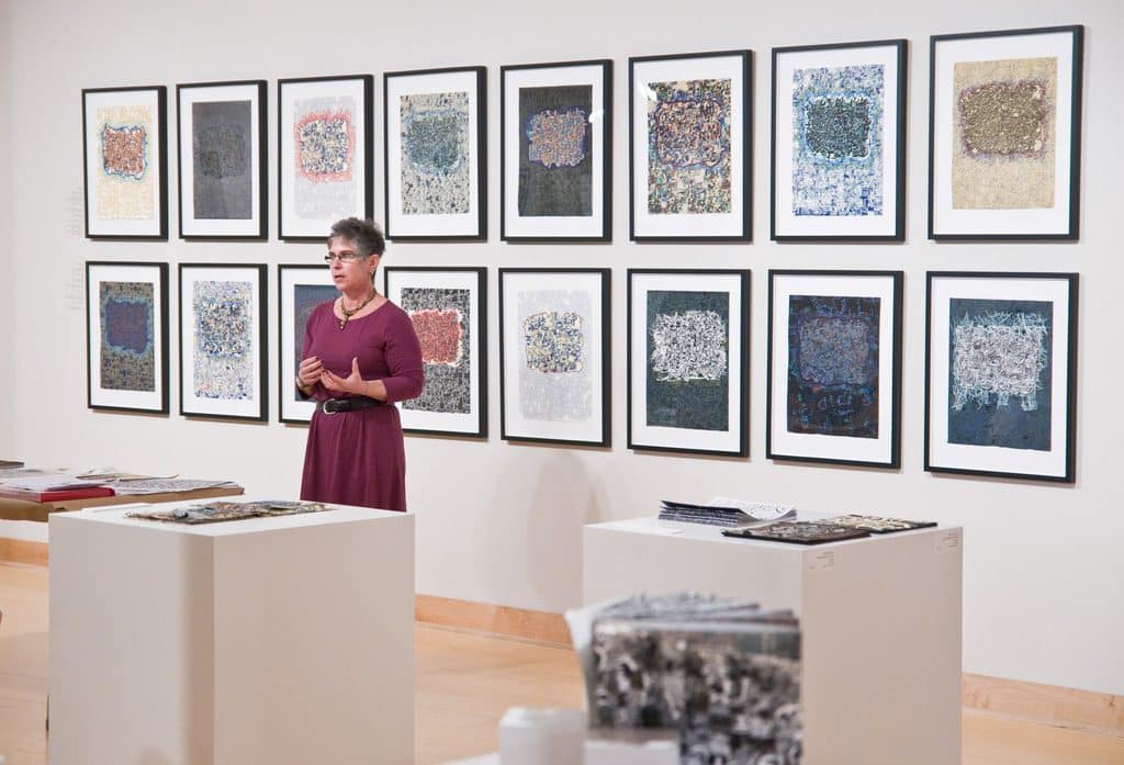
Silkscreens
Through the use of digital imaging, I have preserved the tactile qualities and details found in my relief prints, transferring them onto my silkscreened images. My work continues to explore layering parallels between silkscreen and digital imaging programs and changes in color when printing on different tones of paper. My commitment to this process is found in the series of prints Alphabetic Excursions, Word Maps and Miswired, where my letterforms and glyphs are combined with patterned backgrounds further accentuation their forms. Images from these series are found below.
Miswired
Miswired is a series of digitally drawn silkscreen images describing my father’s cognitive deterioration from dementia, interpreted by abstract shapes, graphs, maps, marks and lines. These prints also incorporate evidence of the different illnesses he suffered through the inclusion of electrocardiographs, range of life curves and other diagnostic charts. Subjects for my prints include: Mild Cognitive Impairment (MCI), Dementia (Lost), and taking away his driver’s license (Revoked). These prints chronicling his failing health, helped me mourn his loss through their making and pay tribute to my beloved father, Herbert Shatzman (1927-2014), who will always be my biggest fan and closest friend.
Alphabetic Excursions
Inspired by my interest in the decoration and patterning surrounding written forms (Medieval illuminated manuscripts, Japanese prints, Mughal and Persian miniature paintings) mapping and signage, these complex and highly detailed prints exclusively use digital technology in the process of my image development.
The marks present in these prints reflect the graphic nature of written forms and their reliance upon formal qualities such as rhythm, pattern, color, shape and composition. The series of prints also draw on aspects of typography, such as ligatures, and my interest in Wild Style Graffiti. This relationship is clearly shown through my use of vibrant colors, haloed edges, complex interlocking letterforms, the rhythmic structure and of the exaggerated, abstracted and intricately bound marks.
Due to the digital nature of the development of these prints, I have been able to envision Alphabetic Excursions as unique impressions, with my images changing depending on the color of my printing paper (including white, black tan, gray, crème, natural and light blue) and the number of layers included in each print. By treating each print as a unique impression, the breadth of each image has drastically grown, highlighting the written forms and patterns found within each image.
Miswired
Miswired is a series of digitally drawn silkscreen images describing my father’s cognitive deterioration from dementia, interpreted by abstract shapes, graphs, maps, marks and lines. These prints also incorporate evidence of the different illnesses he suffered through the inclusion of electrocardiographs, range of life curves and other diagnostic charts. Subjects for my prints include: Mild Cognitive Impairment (MCI) and Losing his Driver’s License due to dementia (Revoked!)
Whatever my dad did, there was always a story, and a funny one at that! Losing his driver’s license was most difficult for him and he was very distraught with the results. During the test he took the driving instructor on a series of errands and mishaps, going the wrong way down one-way streets, driving on the wrong side of the road and leaving the instructor in the car while he briefly attended a meeting.
Miswired: Progression, represented his continual heath decline, leading towards his eventual demise. These prints chronicling his failing health, helped me mourn his loss through their making and pay tribute to my beloved father, Herbert Shatzman (1927-2014), who will always be my biggest fan and closest friend. Not a day goes by that I don’t think of him nor miss him!


