Alphabetic Excursions
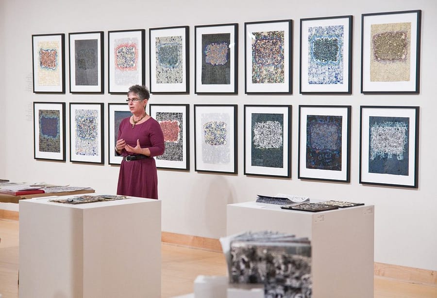
Merrill Shatzman’s combined silkscreen and wood block prints, woodcut constructions and artist books evoke the rich history of calligraphy and letterforms. In the brilliant series entitled Alphabetic Excursions Illuminated Manuscripts (2011) Shatzman reinterprets letterforms utilizing wood cut and digital processes and transcribes them into abstract “glyphs” which compose the multiple rich surface planes of each work. The development of these forms from hand-cut blocks to digitally redrawn glyphs may be seen in the large digital print 18 Hours, 1420 Miles, 500 Tiles (2011). Shatzman’s personal alphabets not only reference the history of art but also contemporary writing practices such as “wild style” graffiti as in Graffiti Glyphs (2011) in which fibers in the rice paper of one layer in the construction have been meticulously cut out to create exuberant way- ward strands. The layering processes that have led Shatzman to expand the picture plane find a new outlet in the series of Cryptic Writing Books the artist is exhibiting for the first time, in which strata of pages and intricate hand-cut openwork letterforms, are combined in three-dimensions.
Edie Carpenter, Curator Word Maps Director, Curatorial & Artistic Programs Green Hill Center for NC Art
Inspired by my interest in decoration and patterning surrounding written forms (Medieval illuminated manuscripts, Japanese prints, Persian paintings) mapping and signage, these complex and highly detailed silkscreen prints exclusively use digital technology in the process of my image development. Originating from scanned drawings made for my woodcut prints, my black and white drawings are manipulated in Adobe Illustrator and then further developed in Adobe Photoshop to create different versions of my original images. The resulting digital drawings are then combined and layered to create complex color interpretations of their earlier, more simplified black and white origins.
The written forms found in these prints reflect the graphic nature of the glyphs and their reliance upon aspects of visual perception such as form, rhythm, pattern color, shape and composition. They specifically highlight calligraphic forms, the similarity of letterform connections to ligatures, and my interest in Wild Style Graffiti, due to their vibrant colors, haloed edges and complex interlocking letterforms. Similar to graffiti, the rhythmic structure of my positive and negative space letter groups are exaggerated and abstracted, intricately binding them together.
Due to the digital nature of the development of these images, I have been able to print Alphabetic Excursions as unique impressions, with each piece changing due to the color of my printing paper (including white, black tan, gray, crème, natural and light blue) and the number of layers included in each print. By treating each print as a unique impression, the breadth of each image has drastically grown, highlighting the written forms and patterns found within each image.
This body of work is divided into two distinct groups: Alphabetic Excursions, images that are exclusively photo-silkscreened; and Alphabetic Excursions: Illuminated Manuscripts, images that combine woodcut and photo-silkscreen. The attention to detail, gridded use of the page and the richness of the image, enhanced by the combination of media, are paramount to the finished print.


